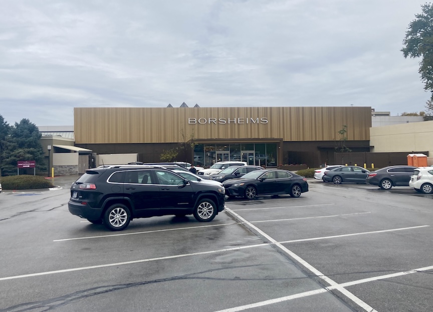
I’ve been keeping an eye on the transformation of the Borsheims jewelry store out at Regency (120 Regency Parkway), where a substantial renovation has been underway since May of 2026. The project promises to transform the more than 20,000-square-foot showroom into a “more open, fluid, and thoroughly modern shopping experience.” Much has been written about the luxury retail experience to come, the handsome materials, and the company’s vision for its new Golden Era. But it is the exterior that has attracted my particular attention, and I must make clear at the outset that this is not intended as a full history of Borsheims, nor is it an explanation of the architects’ intentions. Rather, it is my own examination of the building’s changing architectural identity, the design fashions of earlier decades that its various facades bring to mind, and the broader trends in retail architecture and branding that may help explain its latest transformation. Along the way, we may even uncover a few old acquaintances lurking beneath that fashionable golden disguise.
The new interior design palette has been christened “Luxe Earth,” a rather splendid name suggesting that Mother Nature has a secret jewelry allowance. The concept brings together soft stone, wood, champagne, gold, and bronze accents, with warm, sculptural lighting intended to create an atmosphere of understated luxury. The exterior, meanwhile, is receiving its own golden treatment, with perforated metal panels and a design said to include subtle nods to the company’s heritage. I have no reason to doubt these intentions, although I confess that my detective’s attention was immediately drawn elsewhere. For all the talk of a sleek, contemporary transformation, the building has begun to look remarkably like something I encountered in 1978. And I rather like it.
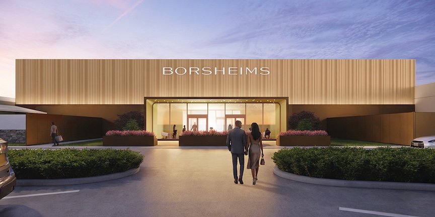
New Borsheims, 2026 computer graphic design. Image courtesy of the Borsheims’ website. Borsheims renovation in Omaha featuring a gold-toned metal facade and recessed glass entrance.
There is something unmistakably Late-Modern commercial about the whole affair. The closely spaced vertical strips across the upper facade, the warm bronze-gold coloring, the great expanse of nearly windowless wall, and the dark, recessed entrance beneath it all belong to a familiar architectural vocabulary. During the late 1960s and throughout the 1970s, suburban department stores and corporate headquarters were particularly fond of these devices. Vertical ribs of wood, metal, or textured concrete were considered the height of sophistication, while great blank walls suggested a certain commercial importance. Windows, apparently, were considered an unnecessary extravagance, although in the case of a jewelry establishment, their deliberate absence is perfectly understandable.
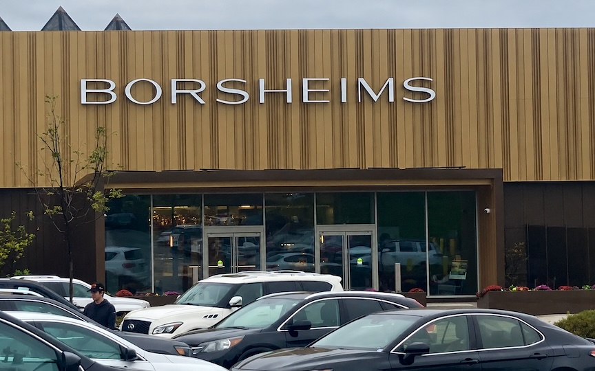
Despite its multitude of vertical lines, the new Borsheims reads as one long, low, emphatically horizontal block. The glass entrance retreats into shadow beneath the projecting facade rather than presenting itself as a separate architectural event. Even the lettering has undergone a transformation, becoming slimmer, more restrained, and considerably more elegant, recalling the sleek, understated sans-serif typography favored by upscale retailers in the 1970s. Taken together, these details evoke the great suburban retail buildings of my youth, and I found myself studying the photographs with the sensation that I had seen this building before.
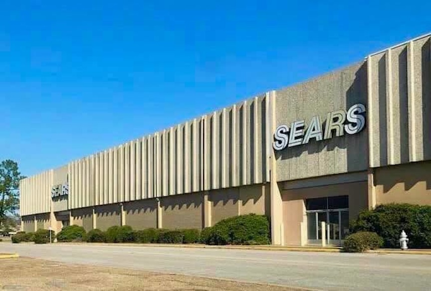
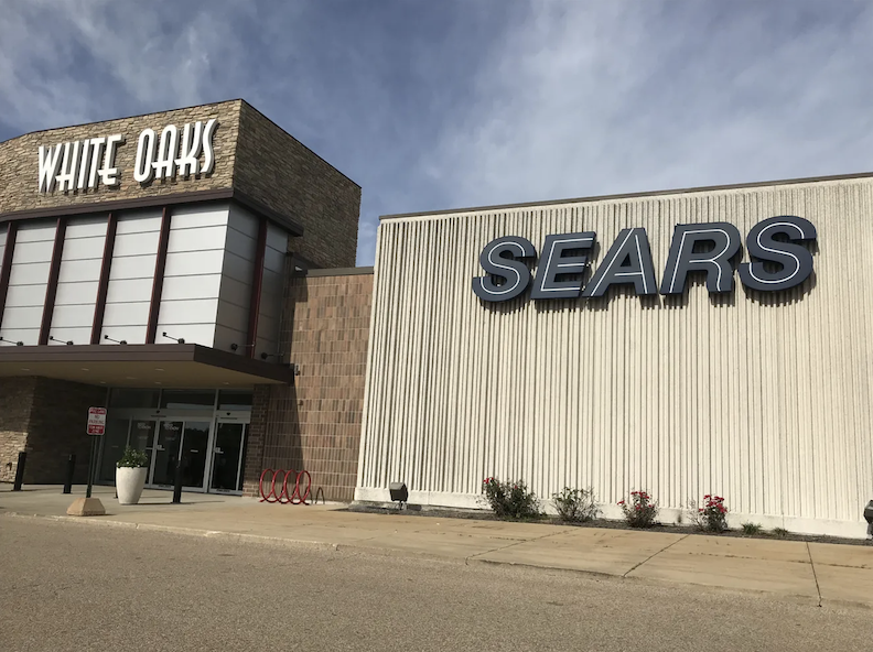
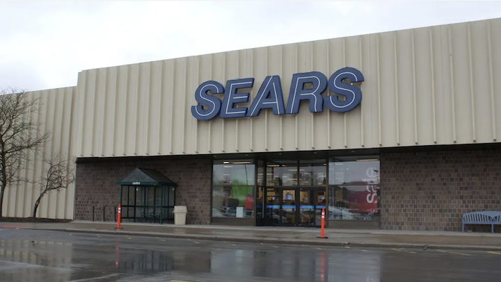
Sears, for one. Those enormous department-store buildings of the 1950s and 1960s, many of them given fashionable new faces during the 1970s, with their broad, windowless upper walls, repetitive exterior treatments, and unapologetically rectangular proportions, seemed to belong to precisely the same architectural family.
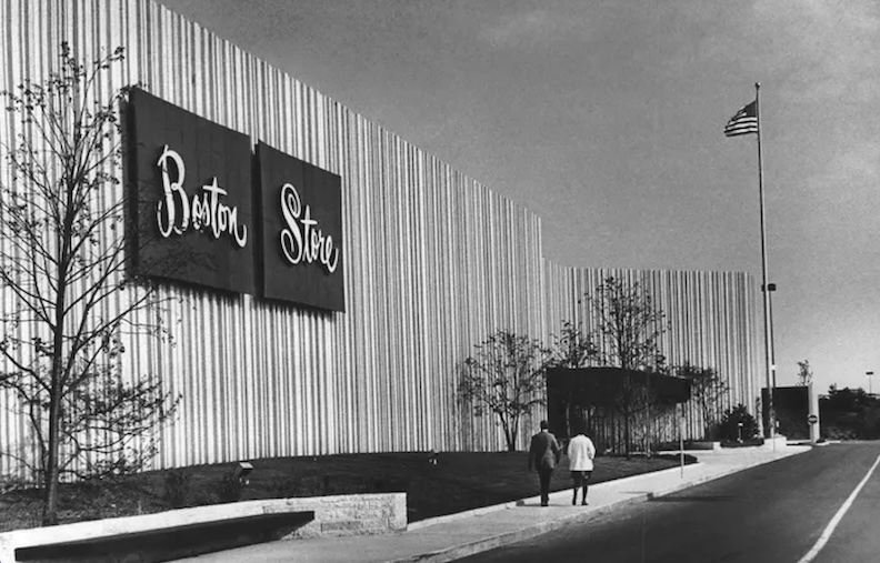
Boston Store, Northridge Mall, Milwaukee. Early 1970s. Those vertical ribs and broad blank walls are particularly close to Borsheims.

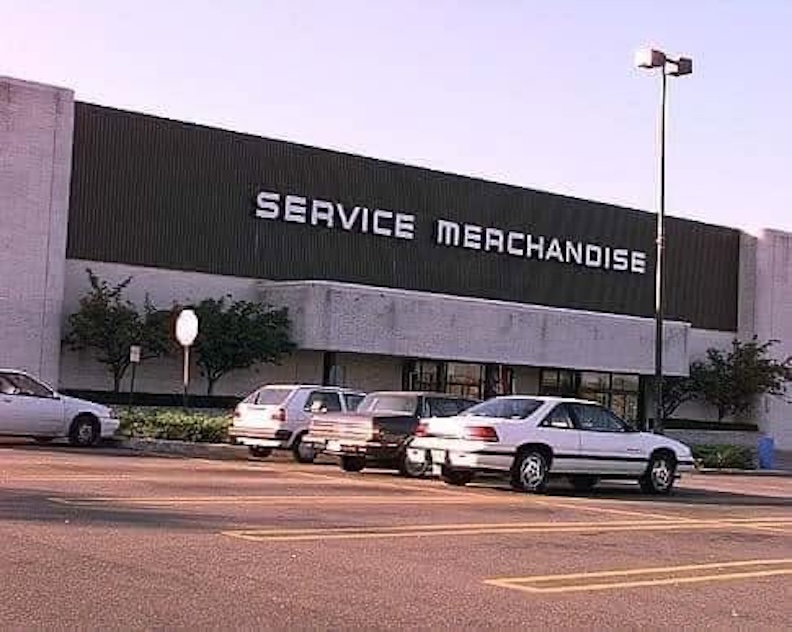
Another old acquaintance came to mind: Service Merchandise, that peculiar institution where one wandered through a showroom examining jewelry, cameras, stereos, silverware, clocks, and all manner of desirable household goods, only to discover that the merchandise one actually purchased was concealed somewhere in a warehouse behind the scenes. You made your selection, submitted your order, and waited for your treasure to appear upon a conveyor belt. The suspense! It was high theater, I tell you. Service Merchandise occupied those large, low-slung suburban commercial buildings that were so characteristic of the period. Broad facades, prominent signs, generous parking lots, and comparatively little architectural ornament were the order of the day.
Now, I realize that comparing a newly renovated luxury jewelry establishment to Sears and Service Merchandise may not be received as a compliment. Some may already be reaching for their smelling salts. But I am speaking of architectural character and messaging, not merchandise, and I refuse to pretend that a familiar design vocabulary becomes unrecognizable merely because it has been dressed for the Golden Era.
Indeed, I find the new Borsheims facade handsome. It is unlike much of what we are presently seeing around Omaha, and for that reason alone it distinguishes itself at Regency. Frankly, at this point, I welcome almost anything that isn’t clad in that ubiquitous sand-colored concrete we’ve been inundated with for the past fifteen years, or another of those peculiar Jenga-like piles of stone, industrial-brushed silver-finished strip malls with those tiresome little shed-roof awnings, supposedly suspended by chains that appear to serve no earthly purpose, overkill, edgy, black buildings, or facades dependent upon a collection of silly, brightly colored lights to give them a personality. (Ooooh I can breathe now…) What interests me most about Borsheims redesign however, is the contradiction between its newness and the age of its visual language. Vertical slat cladding has returned to fashion in contemporary hotels, restaurants, and upscale retail buildings, where it is celebrated as warm, refined, and modern. Yet for those of us who remember its earlier heyday, the effect is wonderfully reminiscent of a 1970s commercial renovation. I am not suggesting that any of these resemblances were intentional on the part of the architects. I am merely reporting what my eyes insist upon seeing. And what I see is something decidedly masculine: a very serious, very expensive gentlemen’s clothing establishment, the sort of place where the suits are beautifully tailored, the lighting is discreet, and nobody would dream of discussing the price. I can appreciate that.
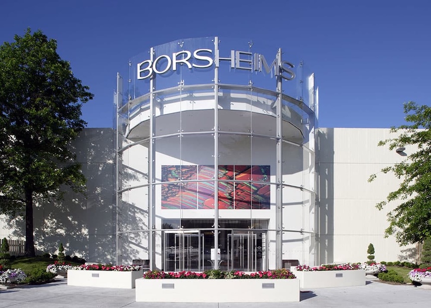
Borsheims, 2006 design. Photograph courtesy of the Borsheims’ website.
Of course, this new exterior also represents a dramatic departure from the previous Borsheims facade, which deserves a few words of its own. The company’s flagship moved from downtown Omaha to Regency in 1986, and a major renovation in 2006 introduced the enormous cylindrical glass entrance that greeted customers for the next two decades. Interestingly, the architectural firm HDR was involved in that earlier transformation and is also responsible for the present renovation. The 2006 spiff-up was a rather theatrical production, with a great curved wall of glass projecting from an otherwise almost featureless white building. There was exposed metal framing, a floating circular canopy, oversized lettering, and a colorful decorative panel above the doors. The former Borsheims facade announced itself in large, bold, rather corporate lettering, perfectly suited to the early 2000s. The entrance appeared determined to announce a glamorous international shopping destination, although the result suggested something closer to a suburban convention center. Perhaps an airport terminal. Perhaps even a casino or a mall entrance. It was a thoroughly recognizable example of the late-1990s and early-2000s enthusiasm for glassy, corporate grandeur. A bit cheesy, if I may be permitted the observation, and certainly not my favorite chapter in the building’s succession of disguises. I should point out that this entrance was admired in its day and received recognition as a considerable architectural achievement.
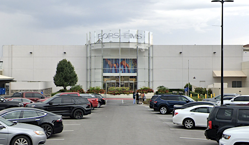
Borsheims as seen in 2024, its pale facade seeming to evaporate into an equally pale sky.
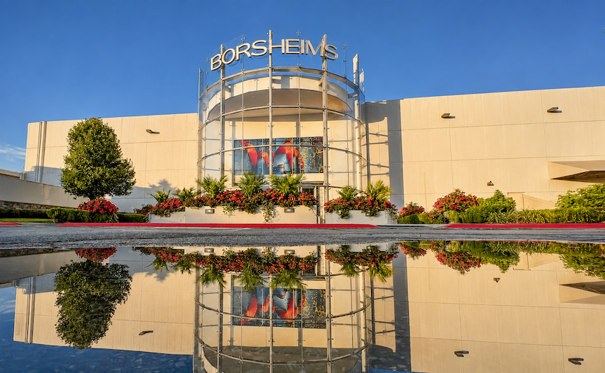
Borsheims as featured on the Regency Shopping Center website. This is positively Disneyesque. I have never seen a reflecting pool in front of Borsheims, and one can only assume it rained rather heavily that day for the parking lot to flood in such an extraordinarily flattering manner. Photograph courtesy of the Regency Shopping Center website.
A New Look for an Old Name
Back in 1986, Borsheim’s was operating at 315 South 16th Street, where, following the closing of Brandeis department store in 1980, it had become downtown Omaha’s largest retailer, employing 60 people and representing four generations of the Borsheim family. It was also one of the largest single jewelry stores in the country. After 116 years downtown, however, a change was in the air. The lease on its 16th Street premises was due to expire in 1987, and United of Omaha, owner of Regency Fashion Court, had approached Borsheim’s about relocating to the former Hovland-Swanson store, the Lincoln-based retailer whose Omaha outpost some of us remember with considerable affection. Remember that glorious retail delight? After more than a century downtown, Borsheim’s was contemplating a move westward.
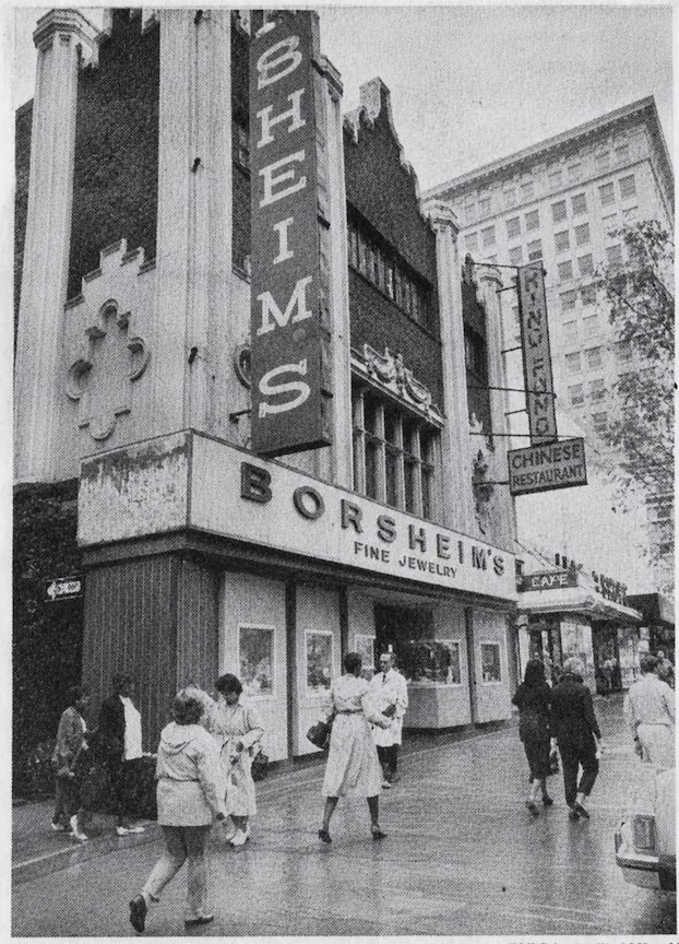
Borsheim’s, 315 South 16th Street, 1986. Photograph courtesy of the Omaha World-Herald. Borsheim’s Fine Jewelry occupied the main floor, while the King Fong Chinese restaurant was upstairs.
They had not yet moved, but a modern new identity had already emerged, no doubt in anticipation of this next chapter. The earlier, enormous, old-fashioned, almost Irish-style BORSHEIM’S lettering had anchored the advertisements with the confidence of a long-established downtown merchant, while the accompanying copy emphasized quality, selection, and unbeatable savings. There was something wonderfully practical about it all. “Come in and see everything we have!”
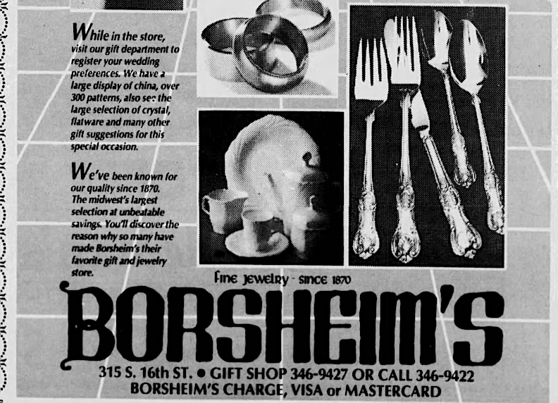
Borsheim’s, 1986. Advertisement courtesy of the Omaha World-Herald.
But by July of 1986, the print advertisements revealed an altogether different personality: a striking geometric monogram, a stylized B enclosed within a diamond-shaped frame, accompanied by a thin, elongated, thoroughly modern BORSHEIM’S wordmark. The entire composition was restrained, almost architectural, and decidedly sophisticated. This new personality seemed to say, “You already know who we are.” Gone was the bustling, familiar identity of a family-owned downtown shop, replaced by the carefully cultivated image of an international luxury brand. It was a rather telling transformation, and one that makes the latest Borsheims reinvention all the more interesting.
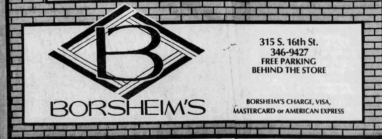
Borsheim’s, July of 1986. Advertisement courtesy of the Omaha World-Herald.
Borsheim’s Goes West
Kiewit Construction handled the remodeling of the former Hovland-Swanson store in August of 1986, to the tune of $200,000. Underwood Construction of Council Bluffs built and installed the black marble and lacquered woodwork, which complemented an interior palette of mauve and taupe. (Oh, the 80s…) When Borsheim’s moved into Regency Fashion Court, however, the store did not yet possess a particularly distinctive facade of its own. To my recollection, nearly every exterior entrance at Regency looked much the same, including the mall’s principal entrances. The defining feature was an enormous, steeply sloping, glass-paneled facade, its narrow vertical divisions establishing a dramatic geometric rhythm that drew the eye upward. There was something of the late-Modern greenhouse or conservatory about the whole arrangement, although its monumental proportions belonged unmistakably to the world of suburban commercial architecture. Suggestive of a mansard roof, the great sloping plane functioned more as an architectural screen above the entrance than as a conventional roof.
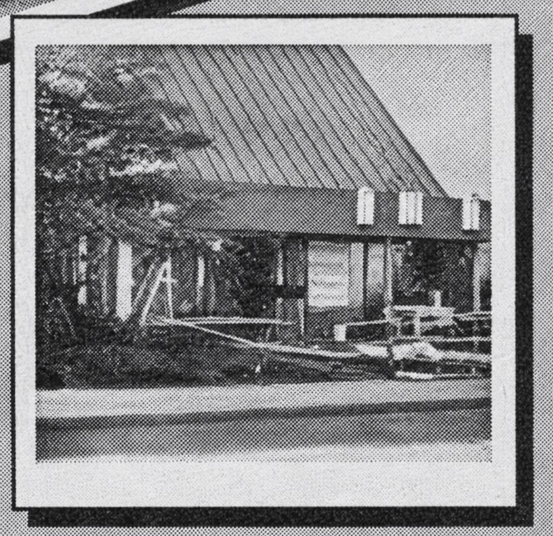
Borsheim’s new location at Regency Fashion Court, fall of 1986. Photograph courtesy of Omaha World-Herald.
Over time, Borsheim’s acquired a more individual appearance, although the underlying architecture remained much the same and matched the rest of the mall. The oversized wordmark and diamond-shaped monogram eventually crowned the composition, while a broad horizontal fascia proclaiming “Fine Jewelry & Gifts Since 1870” anchored the storefront beneath that dramatic glass slope. Regency Fashion Court, now known as Regency Shopping Center, was distinguished by ornamental streetlamps, hanging flower baskets, stone planters, low masonry walls, and carefully arranged landscaping. Together, these softened the severe modernism of the original design, lending the entrance something of the genteel atmosphere of an upscale shopping village.
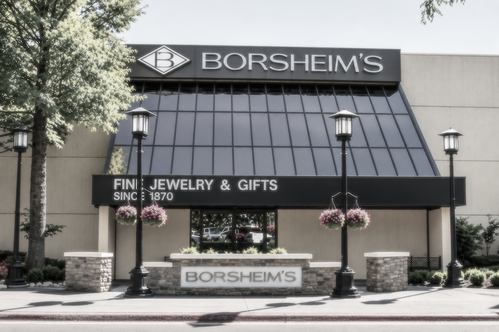
The apostrophe would eventually disappear, and the old familiar Borsheim’s would become simply Borsheims. The apostrophe-free spelling was already in use by 2000.
A Most Curious Architectural Cocktail
The more I studied the new Borsheims facade, the more I began to recognize other architectural acquaintances. There was something decidedly Apple Store about the great glass entrance as depicted in the architects’ rendering, the restrained lettering floating across the upper elevation, and the suggestion of a pristine interior beyond. Apple has spent the better part of the twenty-first century perfecting a particular language of retail architecture: enormous expanses of glass, meticulously finished materials, severe geometric simplicity, and an atmosphere of such studied restraint that one is left in no doubt about the expense of the proceedings. The building itself becomes part of the merchandise, or at least part of the brand. And although Apple generally favors glass unlike the new Borsheims, I could not overlook the family resemblance.
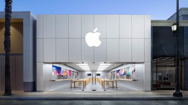
Apple Store photograph courtesy of the Apple website. This store located at The Forum in Carlsbad, California.
What particularly interests me is the marriage of two rather different architectural periods. The enormous, horizontally stretched, vertically ribbed exterior recalls the suburban department stores of the 1970s, while that great illuminated central glass entrance seems to belong much more comfortably to the minimalist luxury retail architecture popularized by Apple in the twenty-first century.
Image courtesy of the Borsheims website.
Everyone’s Golden Era
Then there is all that gold. I began looking at the newer storefronts of the great international jewelry houses—Cartier, Bulgari, David Yurman—and found that Borsheims was hardly alone in its attraction to warm metallic finishes. In fact, one begins to suspect that every luxury jeweler has received the same memo. Borsheims’ own “Golden Era” branding, presented as a distinctive new identity, is actually a part of a much larger architectural fashion. Gold, champagne, bronze, and brass have become conspicuous features of contemporary luxury retail design, sometimes employed with considerable restraint and sometimes with all the discretion of a trumpet fanfare. These warm metals are frequently accompanied by dark glass, black or burgundy accents, pale stone, and carefully controlled lighting. The intention, or at least the effect, is one of expensive permanence, a suggestion of heritage and prosperity wrapped in thoroughly modern materials. Gold, after all, has the advantage of being both the merchandise and the message.
For your consideration, I have assembled a small gallery of recently renovated flagship stores, all from the past two years. Although these other storefronts are considerably more over the top than the new Borsheims, the underlying idea is much the same: gold as a signifier of luxury. I shall leave you to judge the family resemblance for yourselves.
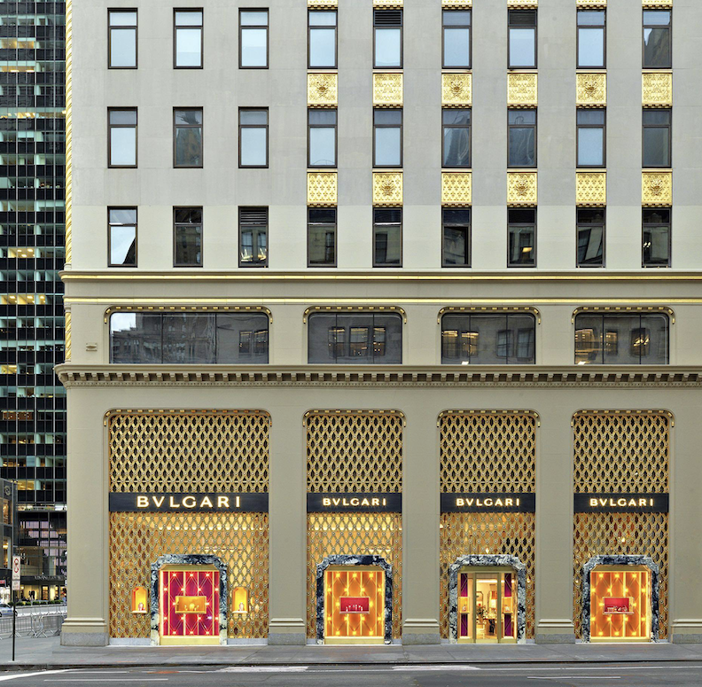
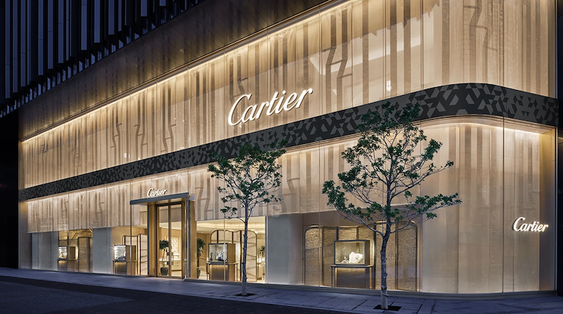
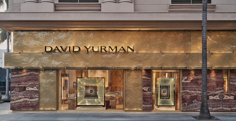
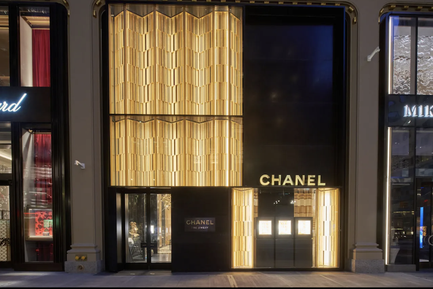
The more I looked at it, the more I began to see both the 1970s and, the 1920s. Of course, the Art Deco movement of the twenties had a tremendous influence on 1970s design. It’s rather fascinating to see these architectural eras conversing with one another again, a century later.
The Architecture of the Moment
There is also something rather clever about the arrangement of the new Borsheims facade. Those closely spaced vertical metallic strips establish a strong sense of mass and an almost monumental rhythm across the broad exterior, giving the building an appearance of considerable weight and solidity. Such treatments can be achieved with metal fins, louvers, or decorative cladding, and they have become familiar features of contemporary commercial architecture. Against this imposing surface, the glass entrance appears all the more luminous. The contrast is nearly theatrical: a great, comparatively opaque golden wall interrupted by a welcoming, minimalist box of light. They call it The Glowing Beacon. The entrance becomes an architectural lantern, drawing the eye toward the activity within while the surrounding facade maintains its rather dignified silence.
I should very much like to see Borsheims’ Glowing Beacon entrance achieve that wonderful, illuminated-from-within quality suggested in the architects’ rendering. I think the rather dark, vertically ribbed exterior positively calls for it. The varying shades of gold in those closely spaced metallic strips are considerably deeper and more subdued than one might expect, and a brilliantly illuminated glass entrance would provide a marvelous contrast, relieving some of the weight and severity of the facade. Of course, the renovation is being carried out in phases, and I cannot say whether the exterior is even finished. Perhaps the grand illumination is still to come.
The Curious Business of Looking Expensive
The new Borsheims facade has abandoned the glassy showmanship of its previous incarnation in favor of something warmer, quieter, and considerably more solid. And yet, there is an oddity about the design that I cannot quite put my finger on. Is it the materials? The peculiar blurring of distinctions between the ordinary and the luxurious? It reminds me of what happened to fashion by the mid-2010s, when a sweater from Target suddenly resembled one from J. Crew, which looked suspiciously like Theory, which in turn might pass for Prada. The distinctions in quality and workmanship had become increasingly difficult to discern, not because inexpensive garments had improved, but because quality had deteriorated across the board. The price tags, naturally, remained quite confident of their differences, even as the lowest end of the market became outrageously expensive.
I suspect the new Borsheims facade is also reaching for the aesthetic of those immaculate kitchens belonging to the beautiful people of new wealth: brushed gold, mixed metals, white Carrara marble, raw open cabinetry, and a few strategically placed plants, all arranged with an air of studied nonchalance. I am reminded of David Brooks’s wonderfully observant 2000 book, Bobos in Paradise, in which he examined the peculiar habits of the bourgeois bohemians, an affluent class that had learned to reconcile enormous wealth with the appearance of modesty, practicality, and enlightened taste. Brooks was particularly amused by the extraordinary sums these people could spend on the simplest things, provided the expenditure could be defended as tasteful rather than extravagant. It is a curious sort of luxury, one that spends a great deal of money to appear as though it has scarcely given money a thought. It is a trend I have watched grow ever more pronounced in the quarter-century since the book appeared. And perhaps that is where my architectural disorientation begins: the familiar commercial vocabulary of 1978, now dressed in the carefully cultivated, effortless luxury of 2026. A subtle sort of bragging, intended for those who recognize the signals. If you know, you know.
I will confide something to you, dear sleuths. I have family members who make the pilgrimage from the coasts to shop at Borsheims every couple of years. They find Omaha rather dumpy, freely mock our supposedly backward ways, and consider even Borsheims’ aesthetic a bit behind the times. Yet they cannot wait to get through those doors. And they are hardly alone. Nearly half of Borsheims’ business comes from outside Nebraska. My relatives know their jewelry and watches, know precisely what they want, and, most importantly, know a good deal when they see one. Borsheims has built an international reputation upon enormous selection, attentive service, and competitive prices, all conducted according to a distinctly Midwestern commercial philosophy. Omaha’s comparatively modest overhead, its quiet wealth, and the considerable buying power of Berkshire Hathaway shareholders have helped make this an unusual retail success. Warren Buffett’s association with the company has certainly done nothing to diminish its reputation. Here is a Midwestern establishment that has attracted customers from around the globe without requiring the architectural grandeur of a Parisian flagship. Which makes me wonder whether these knowledgeable, globe-trotting shoppers care a whit about the building’s appearance. I suspect my relatives would make their jewelry pilgrimage regardless. It is rather like my relationship with Kanesville Records. The place can look however it pleases; I know perfectly well that I shall be digging and rooting through the merchandise until my particular needs are met.
Which brings us back to Borsheims’ Golden Era, with its brushed metals, glowing entrance, and fashionable signals of international luxury. There is something amusing about a successful Midwestern merchant adopting the architectural wardrobe of its more glamorous cousins, particularly when its longstanding appeal has been expensive merchandise without all the accompanying pomp and ceremony. Perhaps the new facade is intended to attract a different sort of customer, or perhaps it is simply time for the old establishment to dress for dinner. Whatever the explanation, I find this curious meeting of 1978 commercial architecture and 2026 luxury both intriguing and faintly disorienting. I should very much like to know whether you sense it as well. There is something fascinating about the speed with which yesterday’s vision of tomorrow becomes today’s remodeling opportunity. And that, dear readers, is what makes this particular architectural case so interesting to me.
Accept no substitutes, dear readers. Check back often for the real deal. The real, in-depth deal! You can keep up with my latest investigations by joining my email group. Simply click on “Contact,” look for “Sign me up for the Newsletter!” and enter your email address. You will receive an update whenever a new investigation is published, delivered straight to your inbox. You are also most welcome to join the company over at My Omaha Obsession on Facebook, where the sleuthing continues.
With love,
Miss Cassette
If you are looking for more architectural mysteries and Omaha history sleuthing, do ask your favorite local bookseller—or even one of the big-box establishments—for my book, My Omaha Obsession: Searching for the City. It is also available through booksellers everywhere online. Thank you, dear readers, for supporting my investigations!
I welcome your thoughts, observations, and recollections concerning Borsheims, Regency Shopping Center, the new architecture, the old 1970s facades, and this curious Golden Era. Perhaps you remember something I have overlooked, or have a few additional clues to contribute to the investigation. Please share them in the Comments section below, where everyone can enjoy reading what you have to say. After all, the sharing of Omaha history is infinitely more entertaining when we put our heads together. And should you prefer to remain incognito, an anonymous smokescreen name will do very nicely. We want to hear from you, dear Armchair Detectives!
© Miss Cassette and myomahaobsession, 2026. Unauthorized use and/or duplication of this material without express and written permission from this site’s author and/or owner is strictly prohibited. Excerpts and links may be used, provided that full and clear credit is given to Miss Cassette and myomahaobsession with appropriate and specific direction to the original content.