Mr. Cassette and I feel very fortunate to own a smart, little, early 1940’s cottage that we very much love. Most of the house still upholds its original integrity, save for a few missteps. A previous owner, decades ago, decided to undertake some unfortunate updating, or “remuddling,” a fitting phrase I recently learned from Kristine Gerber of the Restoration Exchange Omaha. The main thorn in our side is the half-story attic interior “upgrade”, resulting in new 1990’s windows, carpeting, track lighting, ceiling fans, cheap woodwork and a miserable, acrylic insert shower in the sad but oddly spacious bathroom, which might as well be called a Crying Room. Is it shocking to hear what part of our 1941 house is not aging well? For those of you long-suffering the reassembled portions of your older home, is it a surprise to know that all of those newer windows of ours need to be replaced? Which light fixtures and woodwork in our house look worn out and not in a Wabi Sabi way? While the original 1941 features in the house continue to shine year after year, the 1990’s renovations are shameful. Why even said windows are misting up as I type. Oh…no, that’s just condensation trapped between the cheap panes.
This leads to a larger issue for me. It’s one that you may disagree with but I’ve just got to ask it. Why are the windows on new apartment buildings so substandard and small? Why are there so many new ugly apartment buildings popping up in Downtown and Midtown? I believe we are missing opportunities to be beautiful, to build structures of lasting value. I realize not every structure can attain historical status. But what I see around me, in great number, are throwaway buildings being slapped together, lack of quality materials and sad boxy designs, developers getting away on the cheap and neighborhoods left with disposable structures that will deteriorate in 15 years. Much like our half-story attic recast, cheap and quick isn’t cutting it in the long run.
Blackstone Union at 41st Street and Harney
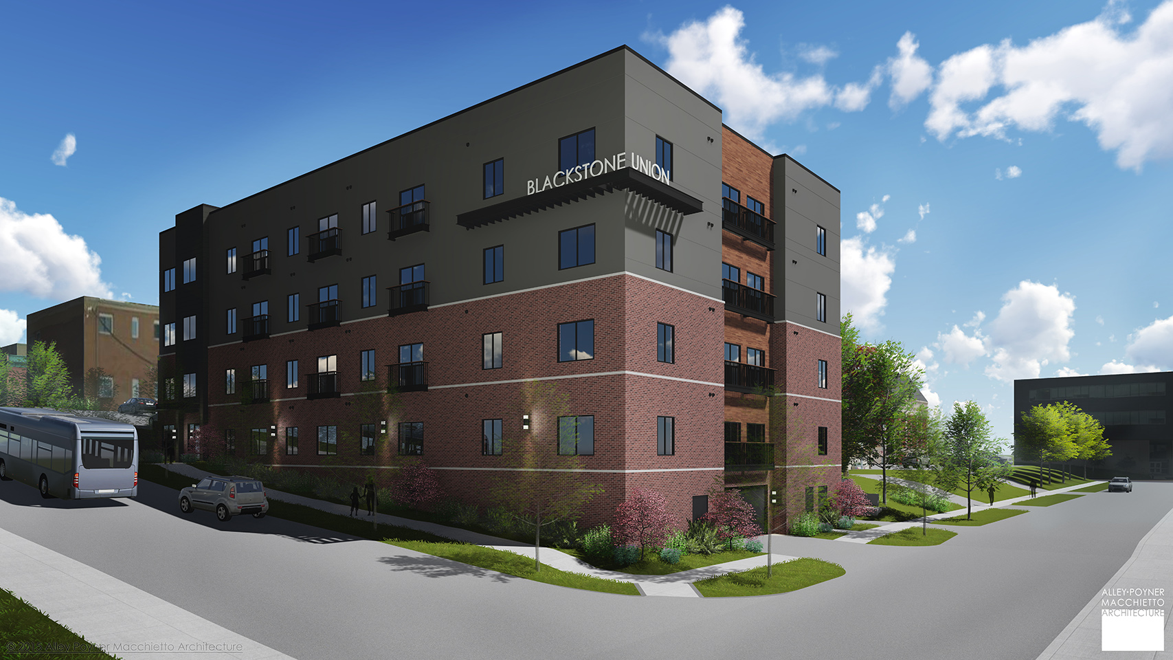
From the OWH—“At 401 S. 41st St., a 39-unit structure of about 42,600 square feet will rise five stories with one level designated for parking. It replaces a 1913 house that had been converted into apartments, and will have a courtyard for tenants to grill out and congregate. This Harney Street building will feature a high-tech study area that caters to UNMC tenants. Each of the sister complexes would have brick as primary material, to fit with the character of the historic Blackstone.”
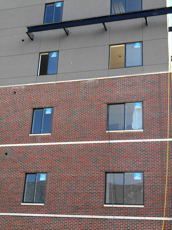
No, not quite. This looks nothing like the beautiful aesthetic of the Gold Coast area or anything along Farnam Street. Blackstone Union is too big, and unsteady for this space, like it will teeter down Harney. The windows are tiny, flat and flush without any treatments or eye for arrangement– like an above ground basement. I get that UNMC students need more housing. The location is premium. Blackstone Union has got the safe proximity to campus, usability, and convenience elements down tight. The interiors could be incredible for all I know. I do hope that’s where the money went.
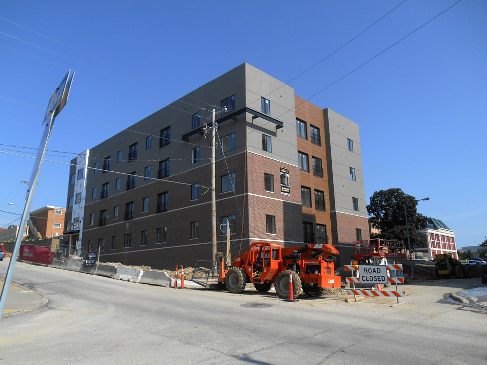
Like many large apartment complexes being built across the country, there is a very silly design format happening. First, start with a big box of brick or wood with other boxes on top with a blend of other facades. Follow that with a mixed bag of small, patchwork, pierced window openings, bizarre framing protrusions, often large metal beams and unstable Juliet balconies and other seemingly unusable balconies. And like a cherry on the top, more decorative wood accents or pieces of metal. The most perplexing thing is this homogeneous look is literally everywhere and I have not seen many neighborhoods where it fits. How is this architecture or urban planning? It’s just superficial decoration on top of a big rectangular box and cheaply so.
The Skye Flats at 50th and Underwood
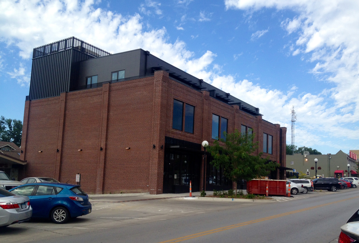
I was originally very worried about the scale of this new midtown mixed space building. Skye Flats are large and awkward looking as you drive east on Underwood. Following the Potpourri Box Model, it initially appeared to be a monstrosity, too big for a little downtown Dundee. But then something happened. I began to see the fine details appearing, like the attention to brickwork,the pilasters, the slightly recessed windows–almost as if it had been an original of Dundee that had recently received some rehabbing. There is a care, vision and use of quality materials with an attempt to fit the historic neighborhood. Trendy? Yes. Denver has its own “Skye Urban Flats.” The west side of the building, with its lack of windows and seemingly haughty shoulder shrug attitude about the strip mall next door, is unfortunate. But I believe that this structure will become an accepted part of the neighborhood over time.

Skye Flats are a different story when viewed from the heart of Dundee, facing west. There is a harmony from a distance.
Hyatt Place Omaha/Downtown-Old Market 540 South 12th Street

Don’t even get me started with this one.
As I type there are even more Mixed Sizing Box Model plans in the works at Blackstone Station, the One at 35th and Dodge and countless others. Potential talk of turning the Lyman-Richey Corporation at 46th and Dodge into apartments has begun. Stay tuned.
Thanks for reading my blog. Please feel free to leave a memory you have in Comments. You can keep up with my latest investigations by joining my email group. Click on “Contact” then look for “Sign me up for the Newsletter!” Enter your email address. It will then display “Thank you, your sign-up request was successful!” Make sure to check your email address to confirm. You will get sent email updates every time I have written a new article. Also feel free to join My Omaha Obsession on Facebook. Thank you, Omaha friends. Miss Cassette
© Miss Cassette and myomahaobsession, 2016. Unauthorized use and/or duplication of this material without express and written permission from this site’s author and/or owner is strictly prohibited. Excerpts and links may be used, provided that full and clear credit is given to Miss Cassette and myomahaobsession with appropriate and specific direction to the original content.
I agree, I find those mixed-media boxes, for the most part, unattractive. I do think the small windows are functional, allowing in less cold and less heat, i.e. easier to “climate control.”
Understandable. I think that placement and design is so important. Windows need to function, in my estimation. I am not sure that these little ones do at Blackstone. Certainly not at the Hyatt. I have
not found windows that open in a hotel in a good long while. Good to hear from you.
All of the buildings look like they house lab rats.
None of them stand out looking like a home for people.
Just some very ugly office space.
Sadly, true. In the words of my galpal, like a prison in the city. Thank you for your input.
Most (not all) developers are primarily interested in the bottom dollar ($$$). The lack of detail and small windows get them to the lowest cost. I can tell you that the owner of the Skye Building did not approach his project in this way (we need more like him!). With news of a potential 300 unit apartment complex at the east end of Dundee (46th and Dodge) by an out of town developer and an out of town architect, I’m concerned we are in for another one of these new buildings with a 20 year life span. It brings up questions for me… if developers were forced to build to higher standards at a higher cost, would there be less development in these areas? Are these developments (that Blackstone building for example) positive despite their lack of interest? I don’t know the answers to these questions, but I’m with you that there are a lot of buildings with little character and likely have a limited lifespan… sad.
Absolutely right on. Thank you for your input on this matter. I, too, have been concerned about this Dodge Street apartment building and wondered by everyone is just lapping it up. This is going to be a mess right out on Dodge. I appreciate your words. Take care
I currently live in the West Farnam, which was built in 1912 as Omaha’s first luxury apartment building. There are only 8 units and all are 1800 sq feet. Sadly, everyone will be asked to leave and renovations will be undergoing which will take several months. Knowing that, I’ve looked at some of the other renovations and some of the newly built apartments in the midtown area. The renovations are the worst – the character remains on the outside and the insides all resemble Celebrity Homes. Most have wood flooring which has been over-polished. Kitchens have granite countertops. Rooms are small. Windows are small. Most have an industrial sleek finish. Many are painted what I call “Old Market gray.” I am told that this is what market studies have proven to be appealing to millennial women and this is their primary target. (Millennial men reportedly don’t care where they live since they can hang out in millennial women’s apartments – told to me by one of the developers.) Several hundreds of apartments are all slated to finish at about the same time with avg 700-800 sq ft at about $1000-$1200/mo. The developers are insisting that there is a need and one is claiming that they already have an almost 100% promised occupancy. As a past realtor this feeding frenzy of apartment construction feels like a bubble about to burst. I see apartments which have sat on Zillow, Trulia, and Craigslist month after month, but the developers are insisting that if you build it, they will come. Time will tell.
I absolutely love the West Farnam. We used to live just north of there in a fantastic duplex. I am so sad to hear of its renovation. We used to live in the Ambassador on 39th and I see they have done this exact remodeling you described to that perfect space. I dont understand where these tenants are coming from? I dont know any millenials that can afford that kind of rent. Thank you for writing in.
Several of us are a bit heartbroken as we’ve grown very affectionate towards the old girl. I’m hoping the oddball things that attracted me here will stay, ie., the weird tiled bathrooms, the sunroom with the weird linoleum floors, the eight huge closets, the weird little architectural details and most importantly a solarium like room with roll out windows. Before I leave I’m putting together a little website so at least we’ll have a photographic record of it. But if you would like to view it in person before the crews start coming in later this summer, send me a note. I know several West Farnam Apartment secrets and would happily give you a tour.
I would like that very much. I remember the sunrooms. Someone in the 90s had a great looking Asian paper lantern in one. The windows are the best and the cunning little hanging address. I will be in touch.
I whole-heartedly concur with what everyone else here is saying about these new ‘gentrified’ structures invading the midtown area. No aesthetics; no style; nothing about them to tie in with the rest of the area. These ticky-tack apt. buildings are there for one reason only: to rake in as much moola as they can from the allotted space. Horribly overpriced, minimally designed, with cheapness abounding. Well over $1000./month rents that are out of most people’s budgets (or the smart ones have a real home for that price, and get equity!) The city’s changing, and some of it not for the better. Old familiar sights torn down & forgotten. It’s hard for a mid-lifer like me to take it all in. The times, they are a changin’………